Amy Novak
Home
About Me
Augmenting the search experience for investors
Avanza
UX & UI
2022-23
Context
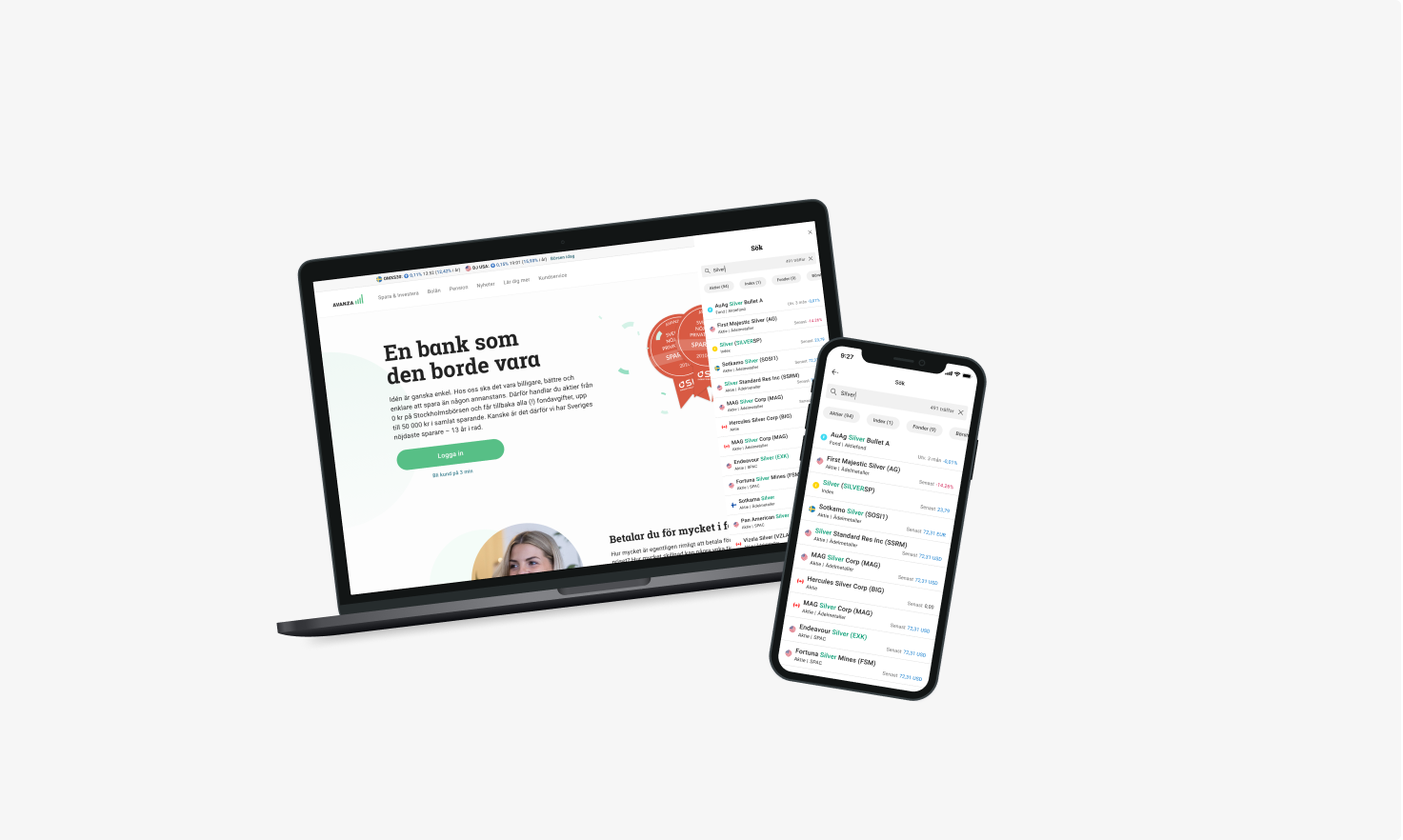
Avanza is a leading digital investment platform in Sweden, used by both novice and experienced investors to research, trade, and manage their portfolios. Search is a core entry point to the product, supporting a wide range of user intents — from quickly finding a specific stock to exploring investment opportunities across markets.
This project focused on improving and aligning the search experience across platforms, ensuring consistency, clarity, and scalability as the product and user needs continued to evolve.
Challenge / Process and Methods
A critical feature, fractured across platforms
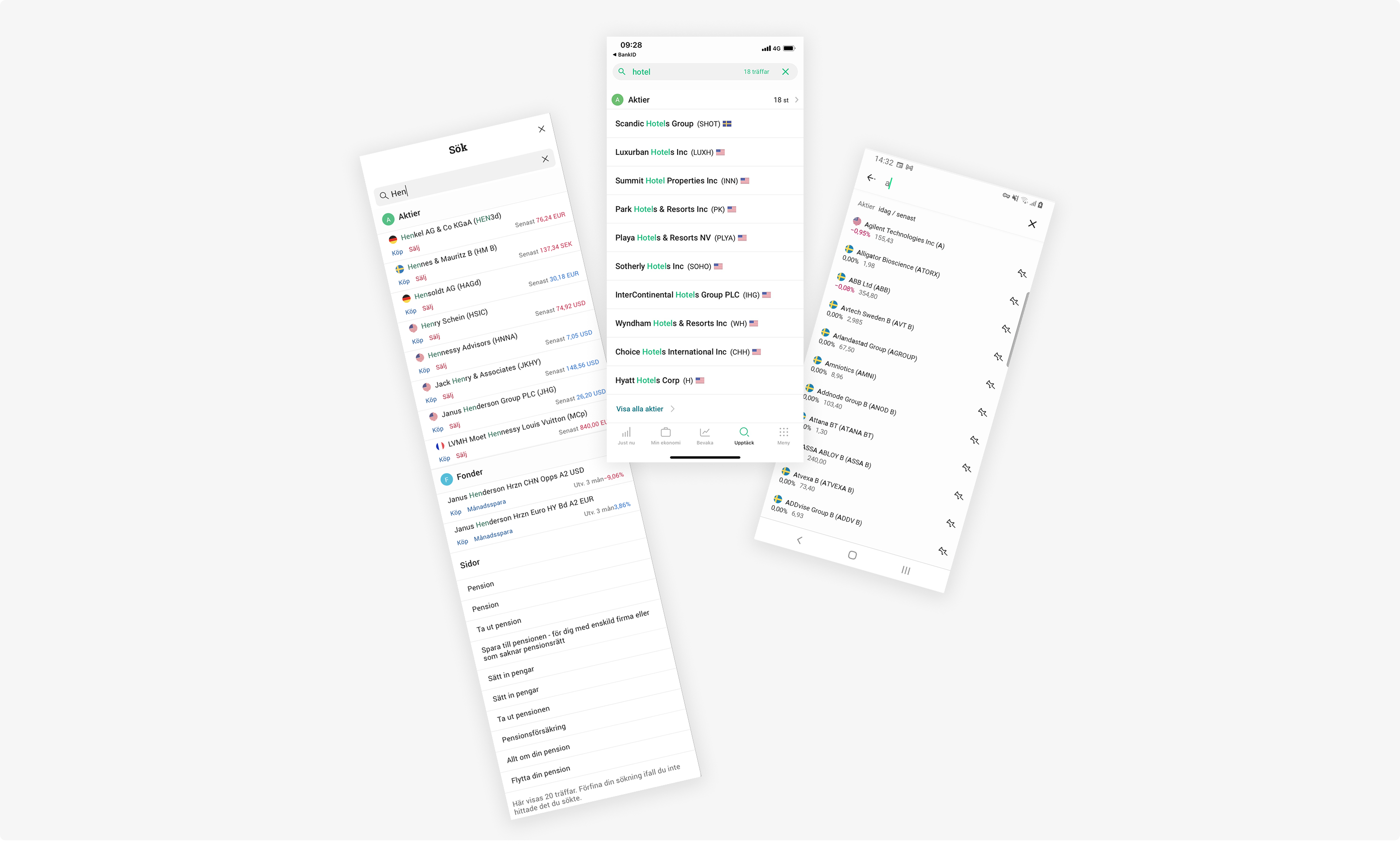
Search is where most investment journeys begin on Avanza. But for users who move between mobile and desktop, as many active investors do, the experience was inconsistent and unpredictable. Each platform had evolved separately, resulting in different designs, different behaviours, and different presentations of the same results.
When the tech team began consolidating the underlying platforms into one, it created a rare opportunity: not just to unify the design, but to properly rethink an experience that millions of users depended on daily.
Process and Methods
A layered research approach, from data to validation
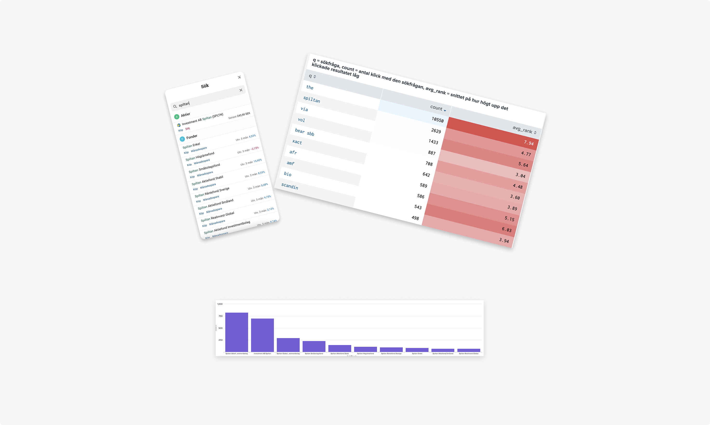
My process involved several steps of research and analysis:
- Quantitative data to understand how users were actually searching, looking for patterns before drawing conclusions.
- Qualitative interviews and unmoderated tests to answer the "why questions" the data raised, exploring the needs of both novice and experienced investors in depth.
- Expert interviews run in parallel, ensuring advanced users with higher demands were understood alongside the broader user base.
- Live beta test to validate the new design in a real context before releasing to all users.

Key Insights
One search box, two very different users
The research revealed a fundamental tension at the heart of the feature:
- Inexperienced investors don't always know what they're looking for. They search by industry or idea, make spelling mistakes, and need guidance to make sense of results.
- Experienced investors know exactly what they want and value speed above everything else.
- The tension required a strategic choice. Prioritising decision-making support over quick actions would serve the broader user base, but came at a cost to experienced investors who valued speed.
- The rationale: quick buy/sell buttons had only ever existed on web, and inexperienced users rarely acted directly from search anyway. The data gave us the confidence to remove the quick buy/sell buttons entirely, prioritising guidance over speed.
Design decisions
Surface the most relevant results first
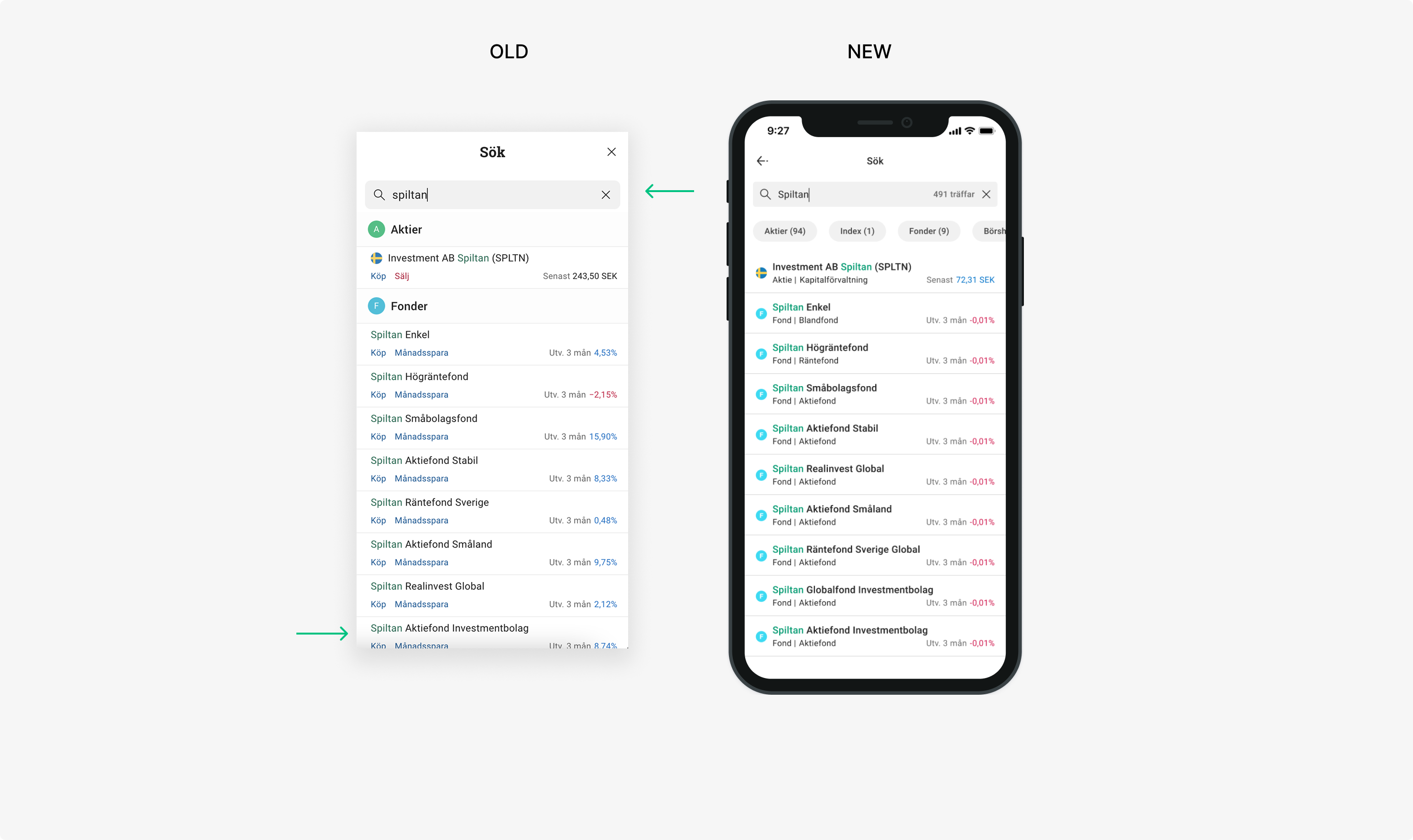
- The sectioned list structure was burying relevant results behind category headers, forcing users to scroll unnecessarily.
- Switching to a mixed list allowed results to be ranked by relevance rather than type, so the most useful result appeared at the top regardless of category.
Give users a faster path to what they need
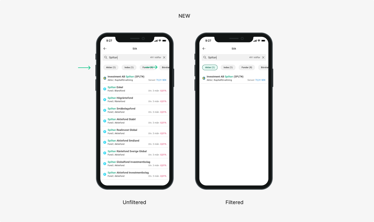
Filter pills gave both user types a way to narrow results quickly without scrolling. Inexperienced investors could explore by category, experienced investors could cut straight to the asset type they wanted.
Prioritise guidance over speed
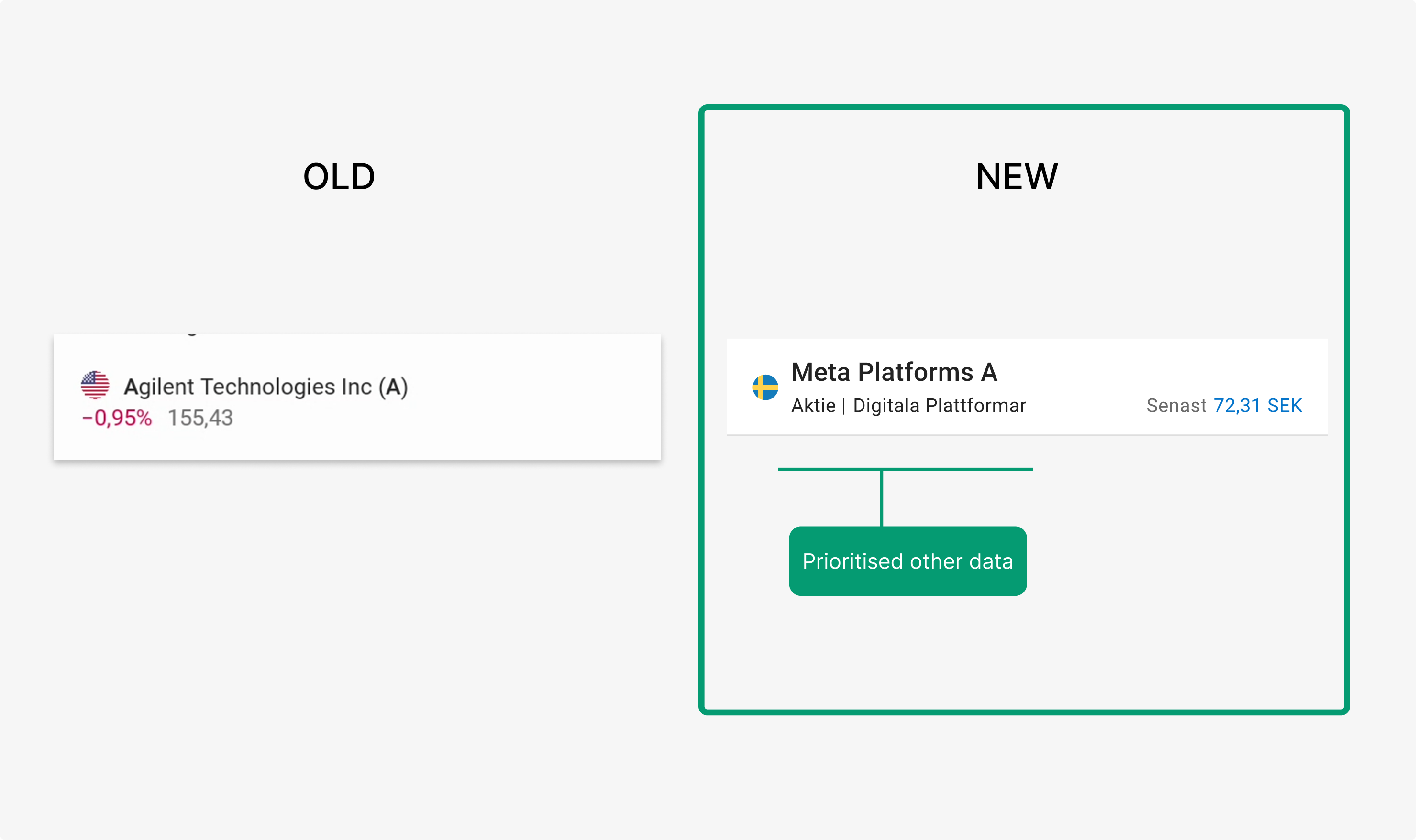
The strategic call to remove buy/sell buttons freed up space for something more valuable: helpful metadata. Adding stock type, industry, and price directly to search results gave users the context to make better decisions without having to click through first.
Outcome
What we validated
The beta test gave us real-world signal before rolling out to all users, validating the new experience before a full release. Following the beta, the updated search experience was released across all platforms with positive reception and no significant negative feedback.
What it made possible
For the first time, search worked consistently across all platforms, giving active investors a reliable experience whether they were on mobile or desktop. Beyond the immediate improvement, the project created a shared design foundation for future search development, something that hadn't existed before.

Amy Novak
Home
About Me
Augmenting the search experience for investors
Avanza
UX & UI
2022-23
Context
Avanza is a leading digital investment platform in Sweden, used by both novice and experienced investors to research, trade, and manage their portfolios. Search is a core entry point to the product, supporting a wide range of user intents — from quickly finding a specific stock to exploring investment opportunities across markets.
This project focused on improving and aligning the search experience across platforms, ensuring consistency, clarity, and scalability as the product and user needs continued to evolve.
Challenge / Process and Methods
A critical feature, fractured across platforms
Search is where most investment journeys begin on Avanza. But for users who move between mobile and desktop, as many active investors do, the experience was inconsistent and unpredictable. Each platform had evolved separately, resulting in different designs, different behaviours, and different presentations of the same results.
When the tech team began consolidating the underlying platforms into one, it created a rare opportunity: not just to unify the design, but to properly rethink an experience that millions of users depended on daily.
Process and Methods
A layered research approach, from data to validation
My process involved several steps of research and analysis:
- Quantitative data to understand how users were actually searching, looking for patterns before drawing conclusions.
- Qualitative interviews and unmoderated tests to answer the "why questions" the data raised, exploring the needs of both novice and experienced investors in depth.
- Expert interviews run in parallel, ensuring advanced users with higher demands were understood alongside the broader user base.
- Live beta test to validate the new design in a real context before releasing to all users.
Key Insights
One search box, two very different users
The research revealed a fundamental tension at the heart of the feature:
- Inexperienced investors don't always know what they're looking for. They search by industry or idea, make spelling mistakes, and need guidance to make sense of results.
- Experienced investors know exactly what they want and value speed above everything else.
- The tension required a strategic choice. Prioritising decision-making support over quick actions would serve the broader user base, but came at a cost to experienced investors who valued speed.
- The rationale: quick buy/sell buttons had only ever existed on web, and inexperienced users rarely acted directly from search anyway. The data gave us the confidence to remove the quick buy/sell buttons entirely, prioritising guidance over speed.
Design decisions
Surface the most relevant results first
- The sectioned list structure was burying relevant results behind category headers, forcing users to scroll unnecessarily.
- Switching to a mixed list allowed results to be ranked by relevance rather than type, so the most useful result appeared at the top regardless of category.
Give users a faster path to what they need
Filter pills gave both user types a way to narrow results quickly without scrolling. Inexperienced investors could explore by category, experienced investors could cut straight to the asset type they wanted.
Prioritise guidance over speed
The strategic call to remove buy/sell buttons freed up space for something more valuable: helpful metadata. Adding stock type, industry, and price directly to search results gave users the context to make better decisions without having to click through first.
Outcome
What we validated
The beta test gave us real-world signal before rolling out to all users, validating the new experience before a full release. Following the beta, the updated search experience was released across all platforms with positive reception and no significant negative feedback.
What it made possible
For the first time, search worked consistently across all platforms, giving active investors a reliable experience whether they were on mobile or desktop. Beyond the immediate improvement, the project created a shared design foundation for future search development, something that hadn't existed before.
Amy Novak
Home
About Me
Augmenting the search experience for investors
Avanza
UX & UI
2022-23
Context
Avanza is a leading digital investment platform in Sweden, used by both novice and experienced investors to research, trade, and manage their portfolios. Search is a core entry point to the product, supporting a wide range of user intents — from quickly finding a specific stock to exploring investment opportunities across markets.
This project focused on improving and aligning the search experience across platforms, ensuring consistency, clarity, and scalability as the product and user needs continued to evolve.
Challenge / Process and Methods
A critical feature, fractured across platforms
Search is where most investment journeys begin on Avanza. But for users who move between mobile and desktop, as many active investors do, the experience was inconsistent and unpredictable. Each platform had evolved separately, resulting in different designs, different behaviours, and different presentations of the same results.
When the tech team began consolidating the underlying platforms into one, it created a rare opportunity: not just to unify the design, but to properly rethink an experience that millions of users depended on daily.
Process and Methods
A layered research approach, from data to validation
My process involved several steps of research and analysis:
- Quantitative data to understand how users were actually searching, looking for patterns before drawing conclusions.
- Qualitative interviews and unmoderated tests to answer the "why questions" the data raised, exploring the needs of both novice and experienced investors in depth.
- Expert interviews run in parallel, ensuring advanced users with higher demands were understood alongside the broader user base.
- Live beta test to validate the new design in a real context before releasing to all users.
Key Insights
One search box, two very different users
The research revealed a fundamental tension at the heart of the feature:
- Inexperienced investors don't always know what they're looking for. They search by industry or idea, make spelling mistakes, and need guidance to make sense of results.
- Experienced investors know exactly what they want and value speed above everything else.
- The tension required a strategic choice. Prioritising decision-making support over quick actions would serve the broader user base, but came at a cost to experienced investors who valued speed.
- The rationale: quick buy/sell buttons had only ever existed on web, and inexperienced users rarely acted directly from search anyway. The data gave us the confidence to remove the quick buy/sell buttons entirely, prioritising guidance over speed.
Design decisions
Surface the most relevant results first
- The sectioned list structure was burying relevant results behind category headers, forcing users to scroll unnecessarily.
- Switching to a mixed list allowed results to be ranked by relevance rather than type, so the most useful result appeared at the top regardless of category.
Give users a faster path to what they need
Filter pills gave both user types a way to narrow results quickly without scrolling. Inexperienced investors could explore by category, experienced investors could cut straight to the asset type they wanted.
Prioritise guidance over speed
The strategic call to remove buy/sell buttons freed up space for something more valuable: helpful metadata. Adding stock type, industry, and price directly to search results gave users the context to make better decisions without having to click through first.
Outcome
What we validated
The beta test gave us real-world signal before rolling out to all users, validating the new experience before a full release. Following the beta, the updated search experience was released across all platforms with positive reception and no significant negative feedback.
What it made possible
For the first time, search worked consistently across all platforms, giving active investors a reliable experience whether they were on mobile or desktop. Beyond the immediate improvement, the project created a shared design foundation for future search development, something that hadn't existed before.