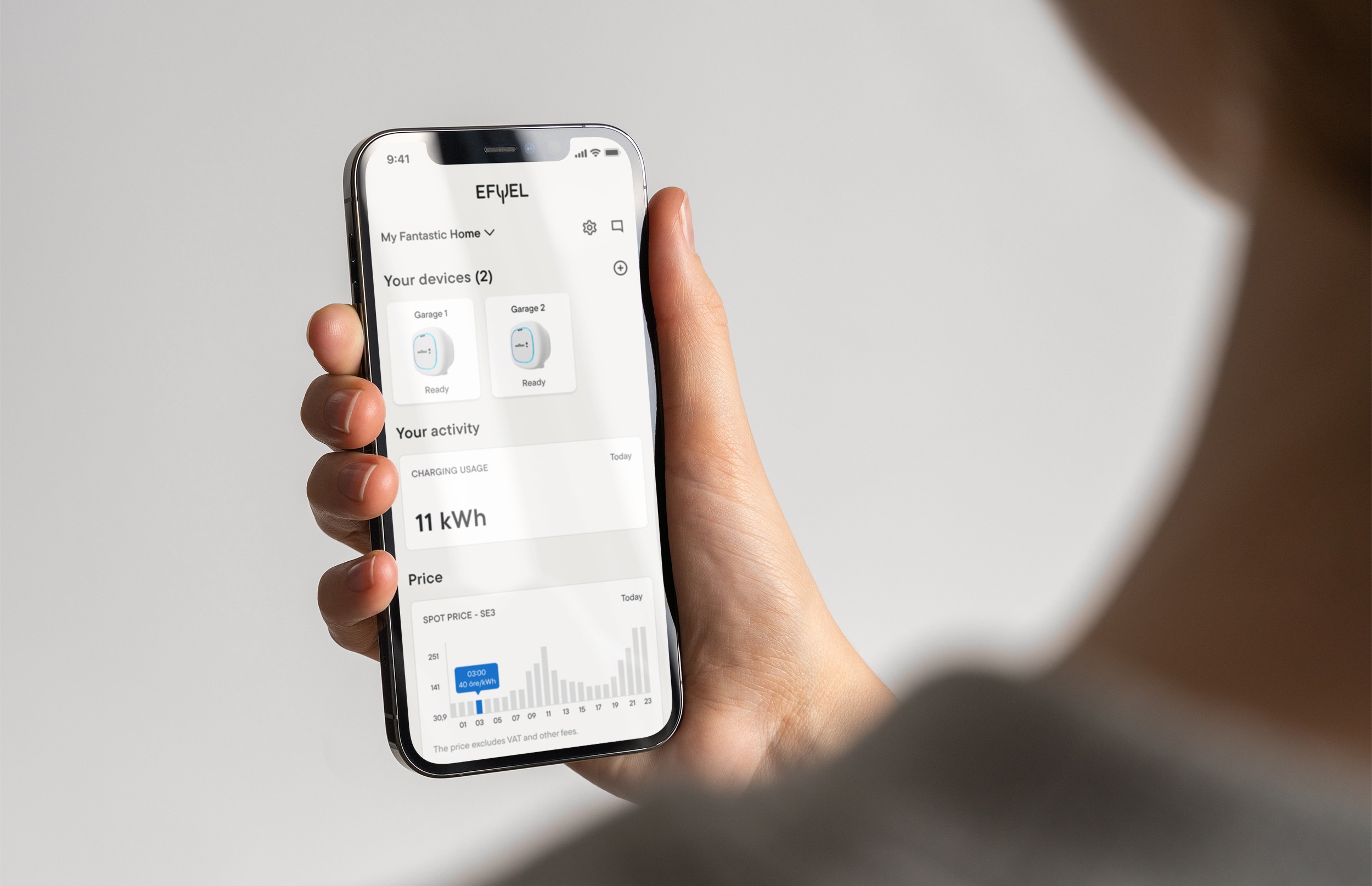
Designing a clearer, more trustworthy EV charging experience
Efuel
UX & UI
2022-23
Context
Efuel sells and install e-car chargers. They also recently started to provide software that helps electric vehicle owners monitor and manage home charging.The app is the primary way users understand their energy usage, costs, and charger status.
Challenge
Making complex energy data understandable and usable
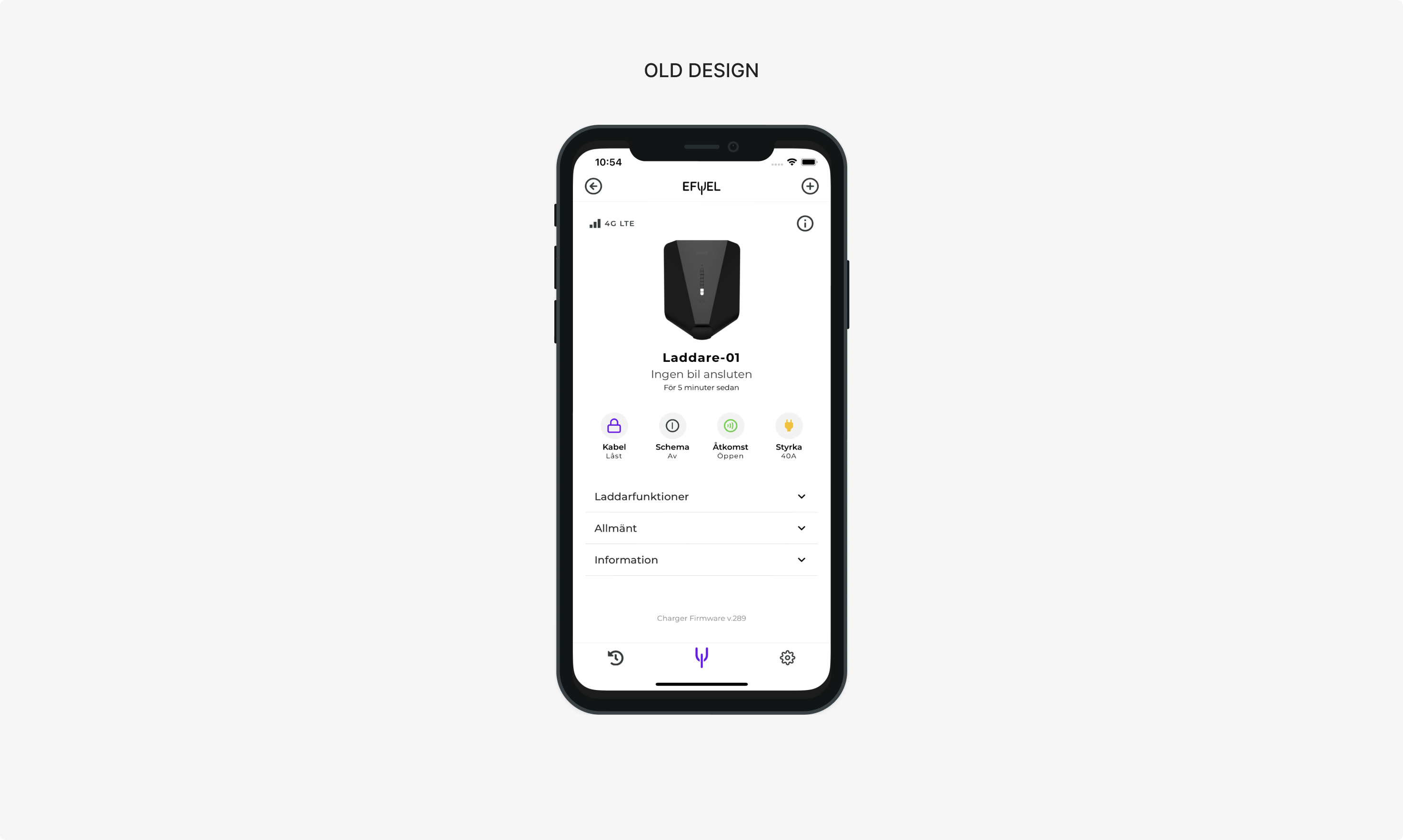
Efuel’s app is the primary interface between EV owners and their home charging infrastructure. As usage grew, the app exposed more detailed energy data — costs, consumption patterns, and charger status — but without a thought-through structure for understanding and making use of it.
This created a risk that users would either misinterpret their energy usage or lose trust in the app altogether. The challenge was to turn complex, system-driven data into a clear and reliable experience that supported everyday decision-making, without oversimplifying information that power users depended on.
Methods used
Reducing uncertainty through research and iterative exploration
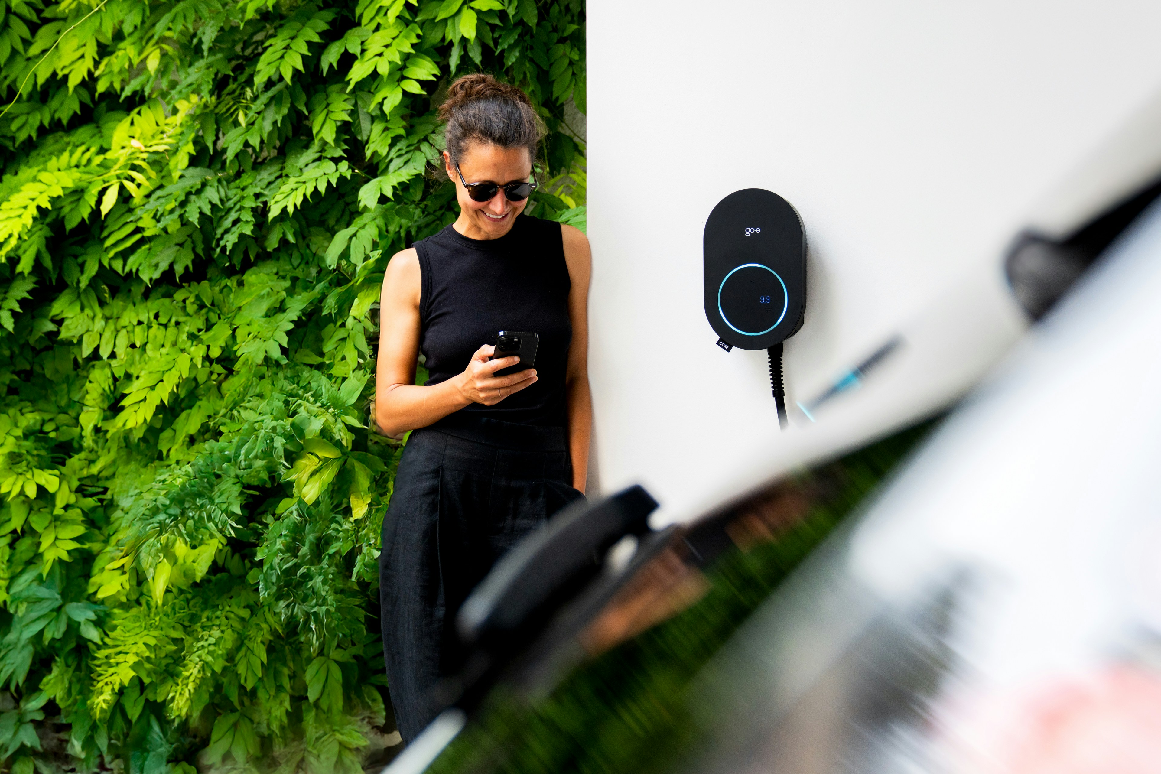
To begin with, I focused on understanding what users find the most useful and important in their charging app.
- I synthesized existing research and support input.
- I conducted interviews with EV owners to uncover gaps in mental models around energy usage, pricing, and charger behavior.
- I also conducted expert interviews with customer support about feedback and pain-points.
- I led exploration across multiple versions of prototypes to quickly test assumptions and validate key decisions.
Throughout, I worked closely with product and engineering to align on technical constraints, ensuring the experience remained transparent without overwhelming users.
Key Insights
The average home charger owner…
- struggled to connect raw energy data to real-world meaning, such as cost implications or charging outcomes.
- users valued clarity and reassurance over granular control in day-to-day use, while still wanting access to detailed information when needed.
- don't use the app for manually starting charging so much, but rather use a key fob for the charger.
- has a routine and schedule for their charging.
- is pre-occupied with keeping their entire home's energy costs low.
These insights shifted the focus from adding functionality to clarifying meaning, confidence, and hierarchy in the experience.
Based on these insights, I reframed the problem from “helping users manage their chargers” to “helping users understand, trust, and take ownership of their energy usage.”

Final Design
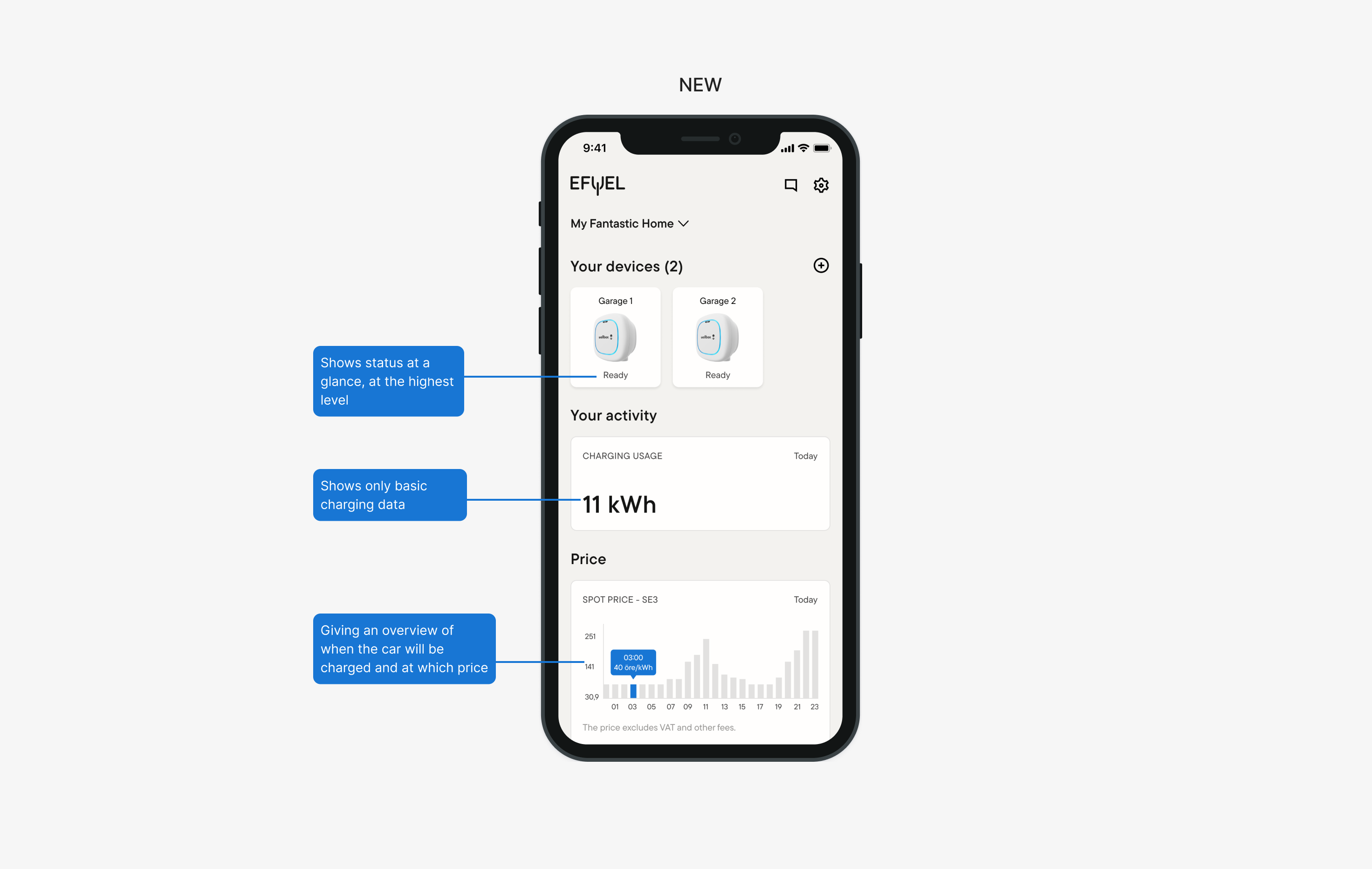
Simplified the overview to provide only the most important information on the landing screen
- Tested a detailed home screen and charger controls easily accessible.
- Learned that this was not wanted by most users.
- Moved to second level for those who wanted it.
FInal Design
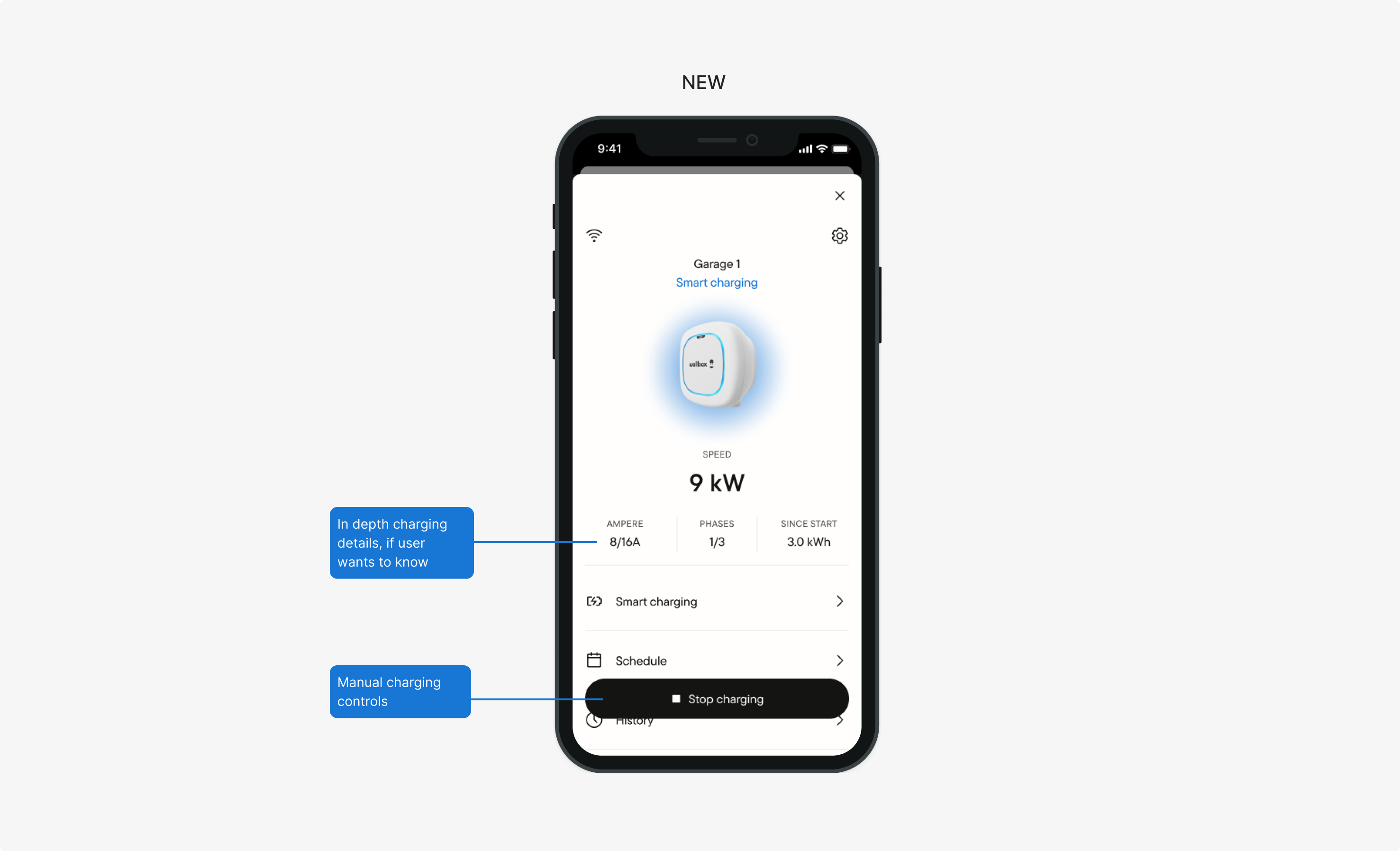
Down-prioritized less important details and interactions for increased clarity
- Moved the charging details from the top to secondary level for those who wanted to see them.
- Also moved manual controls, secondary as they are used less often.
- Kept important information on the top level for a quicker overview.
Designing a clearer, more trustworthy EV charging experience
Efuel
UX & UI
2022-23
Context
Efuel sells and install e-car chargers. They also recently started to provide software that helps electric vehicle owners monitor and manage home charging.The app is the primary way users understand their energy usage, costs, and charger status.
Challenge
Making complex energy data understandable and usable
Efuel’s app is the primary interface between EV owners and their home charging infrastructure. As usage grew, the app exposed more detailed energy data — costs, consumption patterns, and charger status — but without a thought-through structure for understanding and making use of it.
This created a risk that users would either misinterpret their energy usage or lose trust in the app altogether. The challenge was to turn complex, system-driven data into a clear and reliable experience that supported everyday decision-making, without oversimplifying information that power users depended on.

Methods used
Reducing uncertainty through research and iterative exploration
To begin with, I focused on understanding what users find the most useful and important in their charging app.
- I synthesized existing research and support input.
- I conducted interviews with EV owners to uncover gaps in mental models around energy usage, pricing, and charger behavior.
- I also conducted expert interviews with customer support about feedback and pain-points.
- I led exploration across multiple versions of prototypes to quickly test assumptions and validate key decisions.
Throughout, I worked closely with product and engineering to align on technical constraints, ensuring the experience remained transparent without overwhelming users.

Key Insights
The average home charger owner…
- struggled to connect raw energy data to real-world meaning, such as cost implications or charging outcomes.
- users valued clarity and reassurance over granular control in day-to-day use, while still wanting access to detailed information when needed.
- don't use the app for manually starting charging so much, but rather use a key fob for the charger.
- has a routine and schedule for their charging.
- is pre-occupied with keeping their entire home's energy costs low.
These insights shifted the focus from adding functionality to clarifying meaning, confidence, and hierarchy in the experience.
Based on these insights, I reframed the problem from “helping users manage their chargers” to “helping users understand, trust, and take ownership of their energy usage.”

Final Design
Simplified the overview to provide only the most important information on the landing screen
- Tested a detailed home screen and charger controls easily accessible.
- Learned that this was not wanted by most users.
- Moved to second level for those who wanted it.

FInal Design
Down-prioritized less important details and interactions for increased clarity
- Moved the charging details from the top to secondary level for those who wanted to see them.
- Also moved manual controls, secondary as they are used less often.
- Kept important information on the top level for a quicker overview.

Final Design
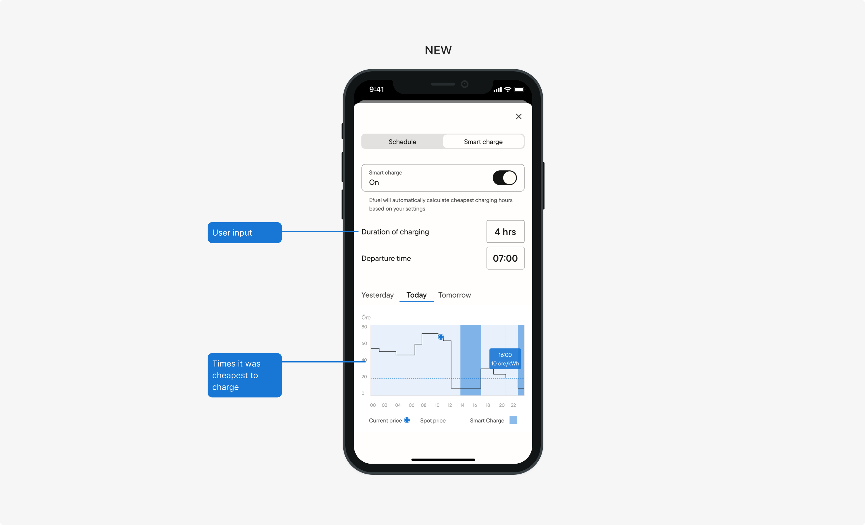
Delivered a money-saving tool for charging
- Allowed users to set up how much they wanted to charge and calculated which times it was cheapest to charge.

Outcome
The MVP validated that better handling of energy costs with smart scheduling was valuable to users, which allowed the team to confidently invest in a launch of the new app to a select group of users.
I left the team at this time, but in my next steps, I would have further monitored the usage through data and qualitative feedback.
Designing a clearer, more trustworthy EV charging experience
Efuel
UX & UI
2022-23
Context
Efuel sells and install e-car chargers. They also recently started to provide software that helps electric vehicle owners monitor and manage home charging.The app is the primary way users understand their energy usage, costs, and charger status.
Challenge
Making complex energy data understandable and usable
Efuel’s app is the primary interface between EV owners and their home charging infrastructure. As usage grew, the app exposed more detailed energy data — costs, consumption patterns, and charger status — but without a thought-through structure for understanding and making use of it.
This created a risk that users would either misinterpret their energy usage or lose trust in the app altogether. The challenge was to turn complex, system-driven data into a clear and reliable experience that supported everyday decision-making, without oversimplifying information that power users depended on.

Methods used
Reducing uncertainty through research and iterative exploration
To begin with, I focused on understanding what users find the most useful and important in their charging app.
- I synthesized existing research and support input.
- I conducted interviews with EV owners to uncover gaps in mental models around energy usage, pricing, and charger behavior.
- I also conducted expert interviews with customer support about feedback and pain-points.
- I led exploration across multiple versions of prototypes to quickly test assumptions and validate key decisions.
Throughout, I worked closely with product and engineering to align on technical constraints, ensuring the experience remained transparent without overwhelming users.

Key Insights
The average home charger owner…
- struggled to connect raw energy data to real-world meaning, such as cost implications or charging outcomes.
- users valued clarity and reassurance over granular control in day-to-day use, while still wanting access to detailed information when needed.
- don't use the app for manually starting charging so much, but rather use a key fob for the charger.
- has a routine and schedule for their charging.
- is pre-occupied with keeping their entire home's energy costs low.
These insights shifted the focus from adding functionality to clarifying meaning, confidence, and hierarchy in the experience.
Based on these insights, I reframed the problem from “helping users manage their chargers” to “helping users understand, trust, and take ownership of their energy usage.”

Final Design
Simplified the overview to provide only the most important information on the landing screen
- Tested a detailed home screen and charger controls easily accessible.
- Learned that this was not wanted by most users.
- Moved to second level for those who wanted it.

FInal Design
Down-prioritized less important details and interactions for increased clarity
- Moved the charging details from the top to secondary level for those who wanted to see them.
- Also moved manual controls, secondary as they are used less often.
- Kept important information on the top level for a quicker overview.

Final Design
Delivered a money-saving tool for charging
- Allowed users to set up how much they wanted to charge and calculated which times it was cheapest to charge.

Outcome
The MVP validated that better handling of energy costs with smart scheduling was valuable to users, which allowed the team to confidently invest in a launch of the new app to a select group of users.
I left the team at this time, but in my next steps, I would have further monitored the usage through data and qualitative feedback.
